HMI
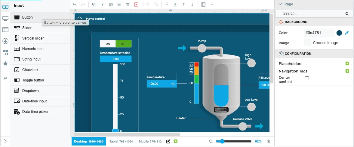
The HMI section of a project allows defining HTML5-based visualizations using an integrated drag & drop editor. You will find this in the project tree as “My HMI” by default. The name of the HMI is displayed as the title in the browser tab and can be changed accordingly.
Creating the HMI
Section titled “Creating the HMI”The HMI editor supports creating one or more pages to display data from the runtime. To target multiple screen sizes — for example a 24” panel PC, a 10” tablet, and a phone — the editor offers a responsive breakpoints workflow. At runtime, the browser picks the closest matching breakpoint based on the available window size, and the page lays itself out accordingly.
Responsive breakpoints
Section titled “Responsive breakpoints”A single page defines all of its components once and reuses them across one or more breakpoints. Each breakpoint is a named size target; new HMIs start with the default set Desktop 1920×1080, Tablet 768×1024, and Mobile 375×812. Breakpoints are managed from the responsive footer at the bottom of the editor — click a breakpoint to switch the canvas to that size, or use the + button to add a new one (name, width, height).
For the full responsive workflow — the breakpoint footer controls, per-breakpoint placement/pin/stretch/offsets/hide, “apply attribute to all breakpoints”, and how the runtime picks a layout — see the dedicated Responsive breakpoints chapter.
The key idea is that every component on the page is a single instance shared by every breakpoint:
- Configure once. Attributes such as color, font, states, target variables, behavior and interactions are set once on the component and apply at every breakpoint. There is no need to re-enter the same configuration for every screen size.
- Place and resize per breakpoint. Only the component’s geometry — position, size, placement / pin / stretch, offsets, and visibility — is stored per breakpoint. Switch to a breakpoint, move or resize the component, and the change applies only to that breakpoint.
- Hide per breakpoint. A component can be hidden at specific breakpoints without affecting the others (for example, hide a side panel on mobile but keep it on tablet and desktop).
- One source of truth. When you need to change a component’s color, label, target variable, or state logic, edit it once and every breakpoint immediately reflects the change. No more visiting every resolution folder and reapplying the same edit.
This is the recommended workflow for new HMIs.
HMI resolutions (Legacy)
Section titled “HMI resolutions (Legacy)”In the legacy model, the navigation and structure of the HMI could be adjusted independently for each screen size, since each resolution held its own pages. At runtime, the HMI would pick the next equal or smaller resolution and render that one.
Create new HMI resolution
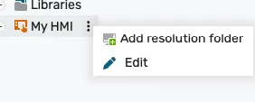
Section titled “Create new HMI resolution”To create a new resolution, right click or click on the 3 dots on the “My HMI” tree node and select Add resolution folder.
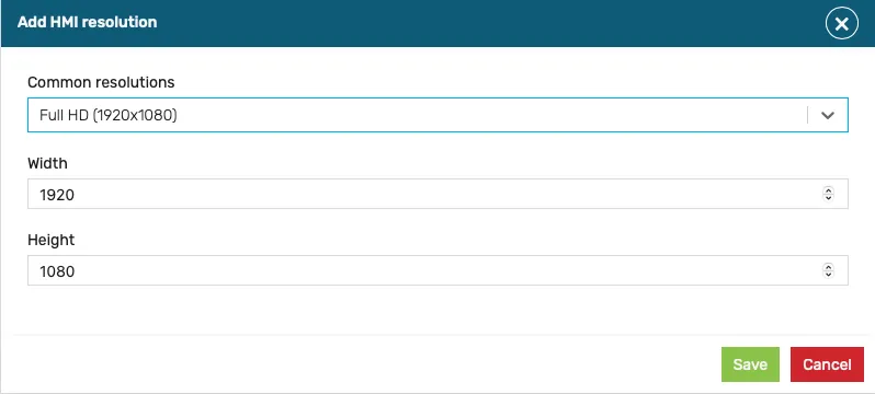
A dialog will be displayed, where either a standard resolution can be selected, or a custom one can be manually input:
Duplicate HMI resolution
Section titled “Duplicate HMI resolution”The typical workflow involved creating the HMI screen at the highest resolution, then duplicating and adjusting the layout for lower resolutions. This was achieved by using the ‘Duplicate resolution’ feature from the main HMI context menu.
Creating HMI pages
Section titled “Creating HMI pages”The HMI is made up of one or more pages. The first page in the list is the default (home page).
In a responsive HMI (the model used by new projects), pages are added directly under the HMI root — there are no resolution folders. Use the ‘Add page’ action on the “My HMI” tree node to add a page; the page is then available at every breakpoint.
Further details
Section titled “Further details”This section of the documentation covers the HMI editor in depth:
- HMI Editor — Tour of the drag & drop editor, its panels and the editing workflow.
- Responsive breakpoints — Design one HMI page that adapts to multiple screen sizes.
- Components — Reference for every HMI component, grouped by category (input, display, layout, navigation, general, custom).
- HMI Navigation — Configure navigation between pages and panel open targets.
- HMI Templates — Create and reuse template pages across an HMI.